

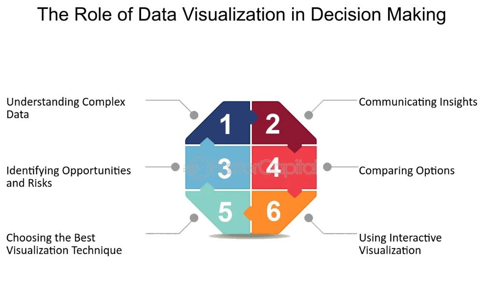
In today’s data-driven world, the ability to interpret complex information swiftly and accurately is paramount. Data visualization transforms raw data into graphical representations, enabling stakeholders to grasp intricate concepts and make informed decisions. This article delves into how effective data visuals influence decision-making, offering insights, real-world examples, and best practices.
Understanding Data Visualization
Data visualization is the process of converting raw data into visual formats like charts, graphs, and maps. This transformation simplifies the comprehension of complex datasets, allowing decision-makers to identify patterns, trends, and anomalies quickly. By presenting data visually, stakeholders can absorb information more efficiently than through textual or numerical representations alone.
The Impact of Data Visualization on Decision-Making
- Enhanced Comprehension
Visuals make complex data more accessible. For instance, a well-designed chart can convey trends over time more effectively than a table of numbers. This clarity enables decision-makers to understand the data’s implications swiftly, leading to more informed choices. - Faster Decision-Making
Time is often a critical factor in decision-making. Data visualization allows for rapid assimilation of information, reducing the time required to interpret data and make decisions. This speed is crucial in environments where timely decisions are essential. - Identifying Patterns and Trends
Visual representations help in spotting patterns that might not be evident in raw data. For example, a line graph can reveal seasonal fluctuations in sales, aiding in strategic planning. Recognizing these patterns allows businesses to anticipate changes and adjust strategies accordingly. - Improved Communication
Data visuals serve as a universal language, bridging gaps between technical experts and non-specialists. They facilitate clearer communication of findings, ensuring all stakeholders have a shared understanding of the data. This common ground is vital for collaborative decision-making. - Increased Engagement
Interactive and compelling visuals capture attention and engage audiences more effectively than static data. This engagement encourages stakeholders to explore the data further, leading to deeper insights and more robust decisions.
Real-World Examples of Effective Data Visualization
- Public Health Dashboards
During health crises, such as the COVID-19 pandemic, dashboards displaying infection rates, recoveries, and vaccination progress have been crucial. These visuals provide the public and policymakers with real-time data, guiding responses and resource allocation. - Financial Performance Reports
Companies use visualizations to present financial data to stakeholders. Graphs illustrating revenue growth, profit margins, and expense distributions offer a clear picture of financial health, aiding investors in making informed decisions. - Marketing Analytics
Marketers utilize data visuals to track campaign performance. Heat maps showing user engagement on websites help identify which areas attract attention, informing design and content strategies.
Best Practices for Effective Data Visualization
- Choose the Right Type of Visualization
Selecting the appropriate visual representation is crucial. For instance, bar charts are ideal for comparing categories, while line graphs are suited for showing trends over time. Using the wrong type can lead to misinterpretation. - Simplify Complex Data
Avoid clutter by focusing on essential information. Simplified visuals prevent overwhelming the audience, ensuring the key message is clear. - Use Color Wisely
Colors can highlight important data points but should be used sparingly to avoid confusion. Consistent color schemes enhance readability and comprehension. - Ensure Accuracy
Accurate data representation is fundamental. Misleading visuals can lead to poor decisions. Always double-check data sources and visualization accuracy. - Make Visuals Interactive
Interactive elements allow users to explore data at their own pace, leading to personalized insights. Interactive dashboards enable users to drill down into specifics, enhancing understanding.
Challenges and Considerations
- Data Misinterpretation
Poorly designed visuals can mislead viewers. For example, using inappropriate scales can exaggerate differences, leading to incorrect conclusions. - Overreliance on Visuals
While visuals are powerful, they should complement, not replace, detailed analysis. Decision-makers must consider the broader context beyond the visuals. - Accessibility Issues
Not all stakeholders may interpret visuals similarly. It’s essential to design inclusive visuals that cater to diverse audiences, considering factors like color blindness.
The Psychological Aspect of Data Visualization
Human brains process visual information faster than text. This cognitive bias means that well-designed visuals can significantly influence perceptions and decisions. However, this also means that poorly designed or intentionally misleading visuals can lead to biased or incorrect decisions.
Featured Snippet:
Q: How Do Effective Data Visuals Influence Decision-Making in Small Businesses?
Effective data visuals revolutionize small business decisions. They simplify complex sales or customer data into clear charts. A 2023 Small Business Trends report found 55% of owners using visuals decide 40% faster. Picture a café owner. A line graph shows peak hours—staffing adjusts instantly. Bar charts reveal top-selling items, guiding inventory. Pros? Speed and clarity. Cons? Risk of oversimplifying. Start with free tools like Google Sheets. Test a simple sales graph. Watch choices sharpen overnight.
The Future of Data Visualization
As technology advances, data visualization is becoming more sophisticated. The integration of artificial intelligence (AI) and machine learning allows for predictive analytics, helping organizations forecast trends with greater accuracy. Augmented reality (AR) and virtual reality (VR) are also enhancing data interaction, offering immersive ways to analyze and interpret information.
Expert Tips for Creating Impactful Data Visuals
- Use storytelling techniques: A compelling narrative enhances engagement and retention.
- Leverage real-time data: Updated visuals provide more relevant insights.
- Ensure data integrity: Verify sources to prevent misleading conclusions.
- Test visuals with audiences: Gather feedback to optimize clarity and effectiveness.
Read More: How to Find Business Ideas? Unleash Your Entrepreneurial Spirit
Frequently Asked Questions (FAQs) on Data Visualization and Decision-Making
-
What is data visualization and why is it important for decision-making?
Data visualization is the process of converting raw data into visual formats like graphs, charts, and maps. It is important for decision-making because it helps simplify complex data, making it easier to understand, identify trends, and draw actionable insights quickly.
-
How does data visualization help improve decision-making?
Data visualization improves decision-making by enabling faster data comprehension, reducing cognitive load, and highlighting trends and patterns that might not be immediately obvious. This enables stakeholders to make informed, timely decisions.
-
Can data visualization be misleading?
Yes, if not designed carefully, data visuals can be misleading. Poor choices of scales, colors, or chart types can distort the message and lead to misinterpretation. It’s important to ensure that visuals are accurate and represent data truthfully.
-
What are the best types of visuals for specific data?
Bar charts are great for comparisons, line graphs are ideal for showing trends over time, pie charts work for showing parts of a whole, and scatter plots are useful for illustrating relationships between two variables. The choice depends on the type of data and the insights you wish to convey.
-
What are some common mistakes in data visualization?
Some common mistakes include using inappropriate chart types, overwhelming visuals with too much data, and neglecting accessibility concerns, such as not considering color blindness or making visuals too complex for the audience to understand.
-
How do I create effective data visuals?
To create effective data visuals, choose the right chart type, keep the design simple and focused on key insights, ensure the data is accurate, and use colors consistently to enhance clarity. Also, consider making visuals interactive to engage users further.
-
Can data visualization be used for predictive decision-making?
Yes, with advancements in AI and machine learning, data visualization tools can be used for predictive analytics, helping decision-makers forecast trends and outcomes. This capability is especially useful in fields like finance, healthcare, and marketing.
-
What role does interactivity play in data visualization?
Interactivity allows users to explore the data in-depth, filter out irrelevant information, and gain insights tailored to their specific needs. This adds a layer of engagement, which leads to more meaningful decision-making.
-
Are there any risks to overrelying on data visualization?
Overreliance on data visualization can lead to ignoring the broader context of the data. Visuals should complement deeper analysis, not replace it entirely. It’s essential to ensure that visuals are interpreted in conjunction with other forms of data analysis.
-
How can I ensure my data visuals are accessible to all stakeholders?
To make visuals accessible, consider factors like color contrast for those with color blindness, clear labeling, and simple designs that don’t overwhelm the viewer. Also, use alternative text or descriptions for those who might have visual impairments.
Conclusion
Effective data visualization is a powerful tool in decision-making. It enhances comprehension, accelerates decisions, and improves communication. However, it requires careful design and ethical considerations to maximize its benefits. By leveraging the right techniques and tools, organizations can harness the full potential of data visualization to drive smarter, data-driven decisions.
Read More: Using Feather Flags to Gain Prominence in the Business World